You Finally Renovated Your Bathroom. Enjoy! Now Move.
 Tuesday, January 8, 2019 at 12:48PM
 Our current house has been our home for almost fourteen years. And probably within days of moving in, we began dreaming how we'd renovate the bathrooms. I clipped magazine photos, saved blog posts, then started Pinning when Pinterest came along...we interviewed several contractors until we found an amazing crew.
We made our building material choices, visited countless tile shops, ordered vanities and fixtures. And finally, finally, we broke ground on the two baths upstairs. But then we decided to move! And although the "new" house has the master bathroom space we've always craved (his and her vanities, a soaking tub, even a sauna for Pete's sake), the materials are not at all in line with what I just painstakingly planned and oversaw installation of in our current home. Also, the boys bath is only slightly larger, in addition to needing a refresh. Since I'm pretty sure tearing out everything and starting over will not be in the budget, I'm going to have to figure out how to make the space feel as dreamy as what we're leaving.
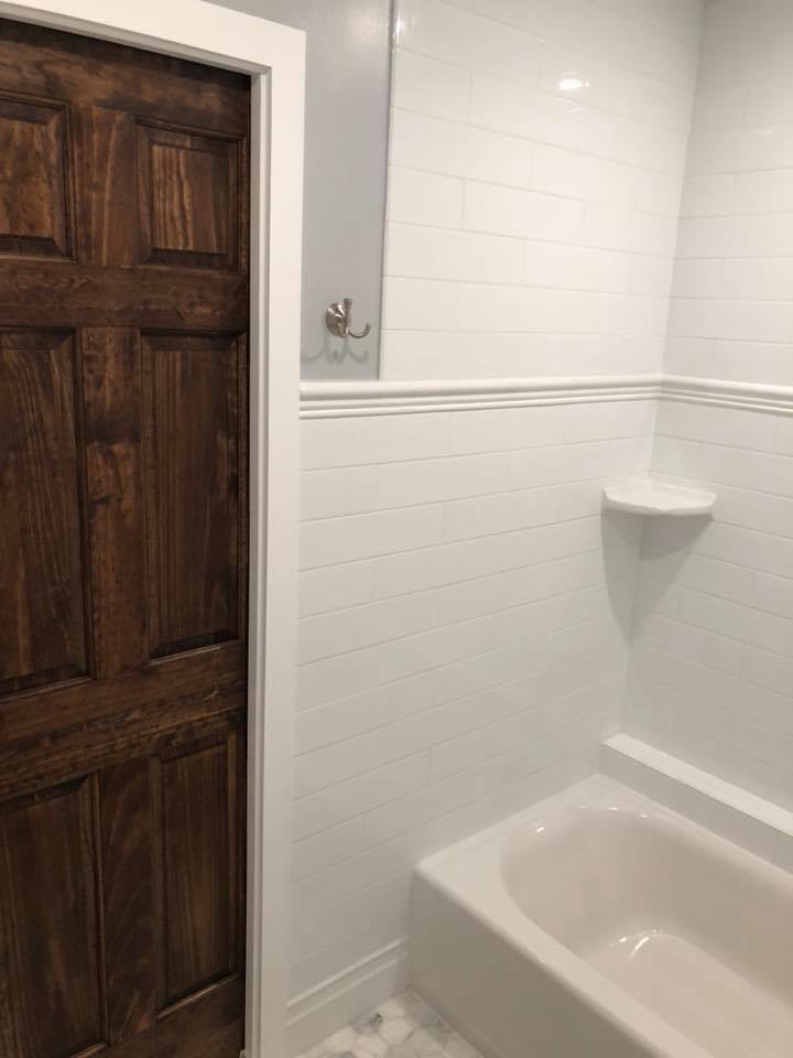
First up was the boys bathroom. I will apologize upfront that there are no "before" pictures. I love me a good before/after reveal with the best of them. And I should have planned accordingly. But I simply never thought of taking photos of the bathrooms in their original state. Let's just say they were depressing. We kept the layout the same, except we added a pocket door. It was such a game changer! We chose a solid wood door and I love the warmth it adds to all of the tile and marble.
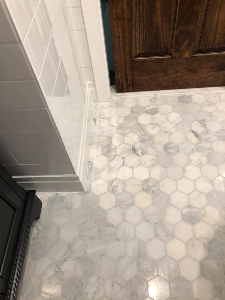
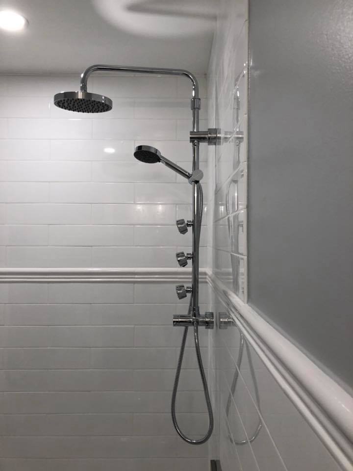
We went with oversized subway tile (4 x 16!) throughout and a marble mosaic hex for the flooring. A detail I love is how we ran the trim molding all around the room, picking up from the tile wainscot and through the shower wall tiles. This did wonders to make the small room feel larger as your eye follows it around the room instead of stopping where the wall tiles stop. Also, splurging on the tile baseboards and ending the runs with bullnose (vice using Schluter strips or the sort) really prevented any choppiness, while striking the classic vibe I wanted. The medicine cabinet chosen is both a surface mount and inset--offering a deceivingly generous amount of storage in such a small space. I can't seem to find an online link but I know I purchased it off the shelf from Home Depot. The lighting is missing bulbs in this picture but we went with a vintage looking bulb style for an industrial meets traditional flair. The shower column came in the wrong polished finish--so ignore that--because we swapped it out. The rest of the finishes are brushed nickel and I'm now such a fan. It has a just a touch of warmth beneath the cool nickel that speaks to my metal-mixing loving heart. So although I didn't mix in any brass here, you can bet I will in the new house.
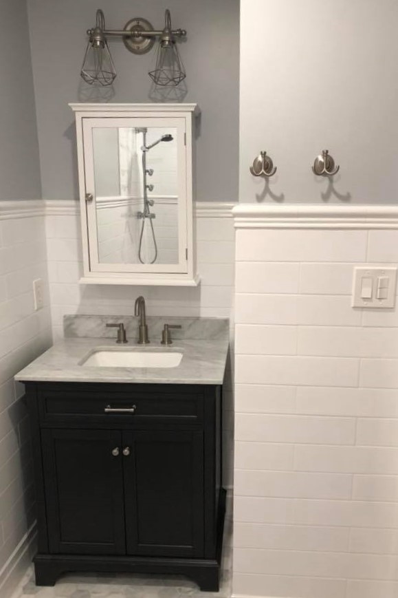
A funny thing about the vanity--we had actually ordered a different one from a supplier on the West Coast. And then it went missing. Our contractors are the speediest folks around--and we simply could not wait for the shipment. So off to Lowe's I went and was delighted to find an off the shelf single vanity that I truly liked. At only 30" it boasts considerable storage. And the dark charcoal color adds a nice contrast. In fact, when we received the other vanity (finally), I decided it was too light for the boys' bathroom (I'll show that vanity later...it ended up in the powder room).
These pictures are just cell phone ones I snapped quickly to share with friends on Facebook. I wish I had remembered to take some better ones once I finished styling the space--we went with a pretty white shower curtain and floor mats, and wooden accessories to inject even more warmth. All of those things are now packed away so perhaps we'll get to see them in the next house.
I'll link to the main materials and sources below. Wanted to save them as I might need them sooner rather than later if I can't stick with my pledge to live with things for a bit in the "new" house. And once I unpack my files and come across the purchasing info for the other materials (like lighting and fixtures), I'll update this post. (p.s. I'll share the master bath reno next.)
Flooring: 3 x 3 Hampton Carrara Hex Marble Mosaic also from the Tile Shop
Vanity: 30" Single Vanity with marble counter top
Paint:
Walls are in Valspar Gravity
Trim and ceiling are Valspar Ultra White



Reader Comments (1)
It looks great! We did a similar thing but with our kitchen. We had to reno it to sell and now our "new" house has another outdated kitchen. Hoping we don't wait another decade to tackle this one. Can't wait to see the new place!!